先前我們介紹了關於 WebComponents 以及他的三大核心內容,這裡我們要透過一個實際的案例來建立一個 Tooltip UI 元件,來進一步熟悉 WebComponent 的實作方式。
在這篇文章中我們會先在頁面的 html 使用 template,然後定義一個 CustomElement 來簡單實作 WebComponent。
後續在另外的章節,我們會再介紹如何將我們實作的 WebComponent 模組化並上傳到 CDN 上供直接使用。
Tooltips 元件是指當滑鼠移到特定網頁元件上,上方或指定方向會跳出一個泡泡提示窗並帶有提示內容文字或是 HTML 內容,可參考下圖:
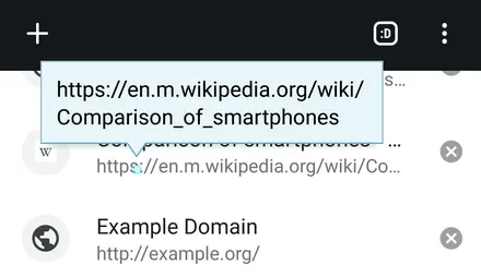 圖片來源: 維基百科
元件設計#
在實作一個 Tooltips,我們會希望:
- 可以在指定元件上方出現泡泡。
- 泡泡內可以帶入指定文字或 HTML。
- 泡泡提示窗可以帶一個箭頭指向指向目標內容元件。
- 當泡泡提示窗在網頁邊緣顯示時,可以自動往網頁中心內縮,避免超出網頁內容區。
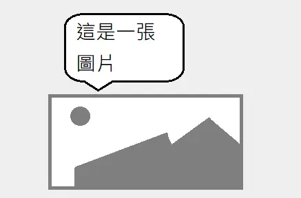
那要使用 WebComponent Custom Elements 來實作 Tooltips 元件,我們先假定實作的 html tag 叫做 my-tooltip,如果要在一個圖片上加上提示窗,希望語法會是:
1
2
3
4
| <my-tooltip alt="這是一張圖片">
<div n></div>
<img src="a.jpg" />
</my-tooltip>
|
而希望畫面呈現出來會像這樣:
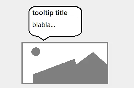
而如果要使用 HTML 當作提示窗的內容,則希望語法會是像這樣:
1
2
3
4
5
6
7
8
9
| <my-tooltip>
<!-- 使用 slot 方式注入 html 提示內容 -->
<div slot="tooltip-html">
<h2>tooltip title</h2>
<hr />
<p>blabla...</p>
</div>
<img src="a.jpg" />
</my-tooltip>
|
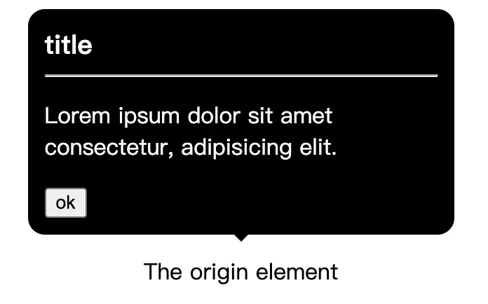
畫面呈現出來要像這樣:
接下來進入實作的階段,首先我們要透過 <template> 標籤來建立 Custom Element 的 HTML 樣版。
 1
 2
 3
 4
 5
 6
 7
 8
 9
10
11
12
13
14
15
16
17
18
19
20
21
22
23
24
25
26
27
28
29
30
31
32
33
34
35
36
37
38
39
40
41
42
43
44
45
46
47
48
49
50
51
52
53
54
55
56
| <html>
<head></head>
<body>
<template id="tooltip-template">
<!-- CSS 樣式 -->
<style>
.hidden {
visibility: hidden;
opacity: 0;
}
.tooltip-container {
position: relative;
display: inline-flex;
align-items: center;
}
.bubble {
top: -7px;
left: 50%;
transform: translate(-50%, -100%);
background-color: #000;
color: #fff;
border-radius: 12px;
padding: 12px;
position: absolute;
}
.bubble::before {
content: "";
position: absolute;
top: 100%;
left: 50%;
width: max-content;
margin-left: -5px;
border-width: 5px;
border-style: solid;
border-color: #000 rgba(0, 0, 0, 0) rgba(0, 0, 0, 0) rgba(0, 0, 0, 0);
}
</style>
<div class="tooltip-container">
<!-- 泡泡提示窗樣版 -->
<div class="bubble hidden">
<!-- HTML 提示內容 -->
<slot name="tooltip-html"></slot>
<!-- 文字提示內容 -->
<span class="tooltip-text"></span>
</div>
<!-- 目標內容元件,當滑鼠移到本元件上時顯示泡泡提示窗 -->
<slot></slot>
</div>
</template>
</body>
</html>
|
上面的樣版定義了 Tooltips 元件的 HTML 模板 與 CSS 樣式,接著我們要定義一個 class 來繼承 HTMLElement,並定義他的行為。
 1
 2
 3
 4
 5
 6
 7
 8
 9
10
11
12
13
14
15
16
17
18
19
20
21
22
23
24
25
26
27
28
29
30
31
32
33
34
35
36
37
38
39
40
41
42
43
44
45
46
47
48
49
50
51
52
53
54
55
56
57
58
59
60
61
62
63
| <script>
(function () {
"use strict";
window.customElements.define(
"my-tooltip",
class extends HTMLElement {
constructor() {
super();
this.attachShadow({ mode: "open" });
this.handleMouseEnter = this.handleMouseEnter.bind(this);
this.handleMouseLeave = this.handleMouseLeave.bind(this);
}
connectedCallback() {
// 先清空 shadowRoot
this.shadowRoot.innerHTML = "";
// 使用 template: #tooltip-template 來渲染 DOM
this.shadowRoot.appendChild(
document
.getElementById("tooltip-template")
.content.cloneNode(true)
);
const tooleContainer =
this.shadowRoot.querySelector(".tooltip-container");
const htmlSlot = this.shadowRoot.querySelector(
'slot[name="tooltip-html"]'
);
const textSpan = this.shadowRoot.querySelector(".tooltip-text");
if (this.hasAttribute("alt")) {
const altText = this.getAttribute("alt");
if (altText.trim() !== "") {
htmlSlot.style.display = "none";
textSpan.textContent = altText;
} else {
textSpan.style.display = "none";
}
}
// 綁定 hover 事件
tooleContainer.addEventListener(
"mouseenter",
this.handleMouseEnter
);
tooleContainer.addEventListener(
"mouseleave",
this.handleMouseLeave
);
}
handleMouseEnter() {
const bubble = this.shadowRoot.querySelector(".bubble");
bubble.classList.remove("hidden");
}
handleMouseLeave() {
const bubble = this.shadowRoot.querySelector(".bubble");
bubble.classList.add("hidden");
}
}
);
})();
</script>
|
上面的範例程式中,我們使用 window.customElements.define 定義了一個 my-tooltip 的 Custom Element,並透過一個繼承 HTMLElement 的 class 來定義這個 Custom Element 的行為,像是 mouseenter 及 mouseleave 的事件處理。
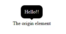
在完成 Custom Element 的定義後,可以透過下面的語法來使用這個 Custom Element:
1
2
3
| <my-tooltip alt="Hello!!">
<span>The origin element</span>
</my-tooltip>
|
可以看到渲染的效果如下:
除了透過在泡泡提示窗顯示文字內容,也可以使用 HTML 格式來顯示提示內容:
1
2
3
4
5
6
7
8
9
| <my-tooltip>
<div slot="tooltip-html">
<h3>title</h3>
<hr />
<p>Lorem ipsum dolor sit amet consectetur, adipisicing elit.</p>
<button>ok</button>
</div>
<span>The origin element</span>
</my-tooltip>
|
完整範例可參考: CodePen
今天我們透過使用一個簡單的 Tooltips 元件範例,示範了如何自定義一個 Custom Element,定義後即可在網頁中重複使用,後續的文章也會再介紹如何將我們的元件模組化,並上傳到 npm 與 CDN 上來提供安裝與使用。
 on [Unsplash](https://unsplash.com/)](https://yishiashia.github.io/posts/webcomponent-introduction-2/photo-1530811761207-8d9d22f0a141_hufc2363791d5b26ee71905b9d1bcb064f_238958_360x0_resize_q75_h2_box_2.webp)